By Julie Nobes Interior Design
Bringing colour into a room needs careful planning. The Maximalist approach throws all textures, patterns and colours into one pot but how are you able to focus on any one feature?
This recent library transformation demonstrates that saturating a space with competing shades rarely achieves the desired effect. Often, too much colour fractures the eye, making a room feel busy rather than cohesive.
True impact comes from knowing how to edit. By paring back the palette, anchoring a single architectural feature, and introducing carefully chosen accents, you can create a room that feels cleaner, more coherent, and infinitely more tranquil to relax in.
Creating a Serene Backdrop
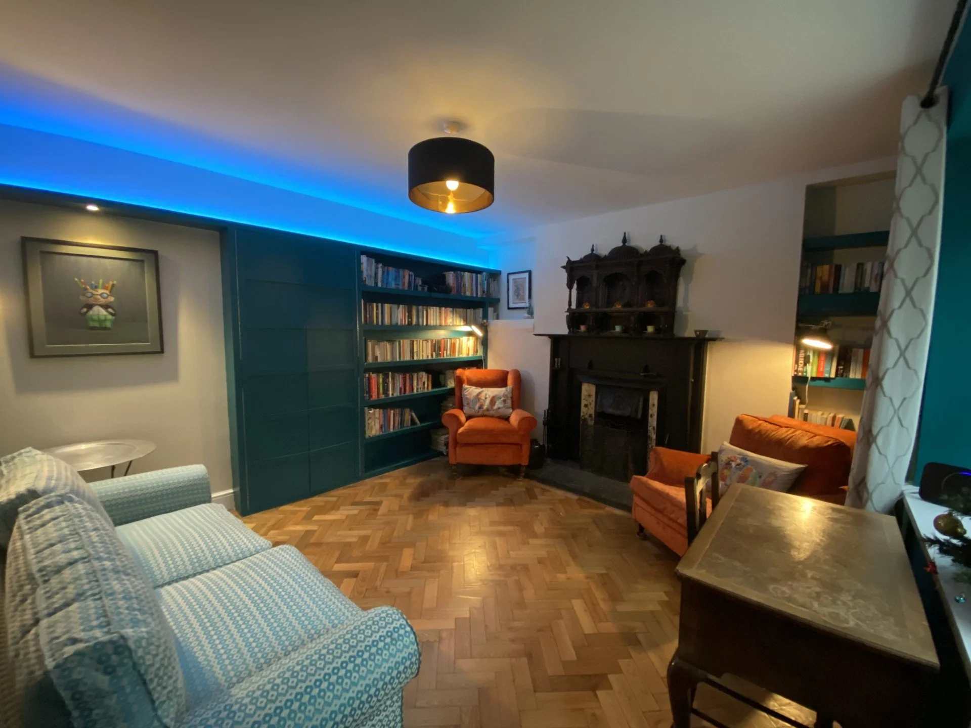
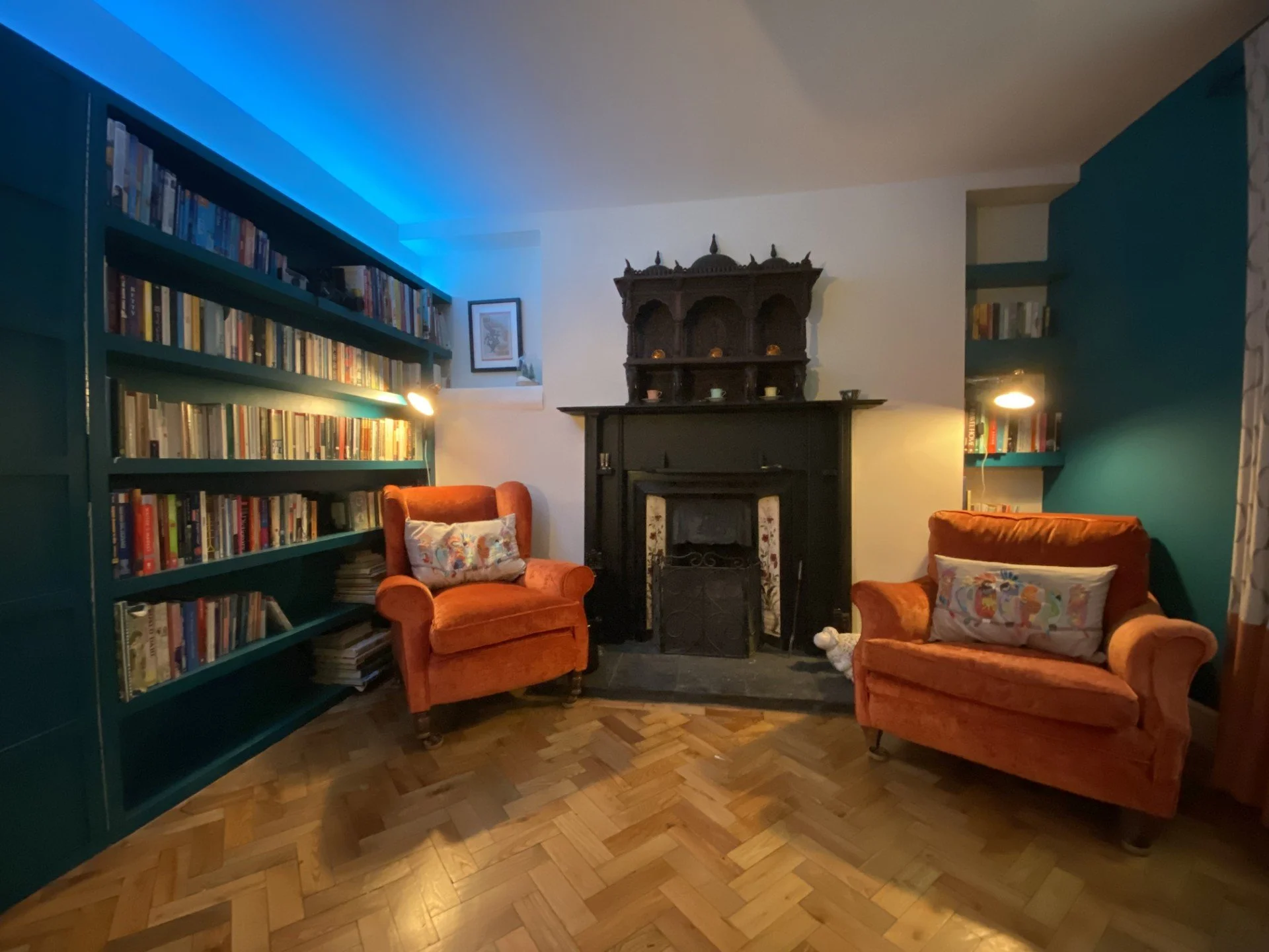
In the original room, heavy teal walls, matching cabinetry, and bright blue strip lighting competed for attention, overwhelming the traditional fireplace and herringbone parquet flooring.
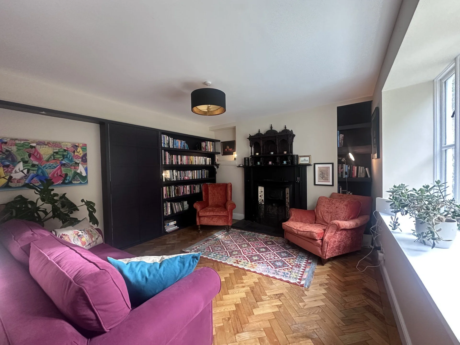
To allow the room to breathe, we stripped back the competing tones and painted the walls in Jo’s White. Using a warm, chalky neutral as a foundation immediately made the room feel fresh and bright, establishing a calm, serene canvas where the eye can easily rest.
Focussing on a Key Feature for Depth
Rather than spreading dark or bold tones across every surface, the secret to successful colour placement is to focus on one defining element. We refinished the bespoke fitted bookcases in Pean Black. By concentrating this rich, dark shade solely on the joinery, it ties in effortlessly with the intricate black fireplace surround. This creates genuine architectural depth and frames the books without closing the room in.
Adding Colour Through Warmth and Texture
Once you have a clean, balanced envelope, colour works much harder when introduced through tactile soft furnishings and deliberate accents:
Reupholstered in Melbury linen, the sofa brings an effortless, natural softness that bridges the crisp contrast between the white walls and black bookcases.
To inject real warmth and character, the fireside chairs were finished in a rich burnt orange velvet. Set against the serene backdrop, this vibrant accent colour adds immense depth and cosiness, naturally drawing you toward the hearth.
This project is a testament to the power of restraint. When you pare back a palette and let colour work with intention, the result is a space that feels balanced, welcoming, and effortlessly timeless.
Looking for guidance on how to balance colour and calm in your own home? Get in touch with Julie Nobes Interiors & Design to discuss your next project.
We also do one-to-one colour workshops if you’re looking for inspiration for your own home.